Crescent Masterpiece
Tuesday, May 1, 2018
By John Helsley
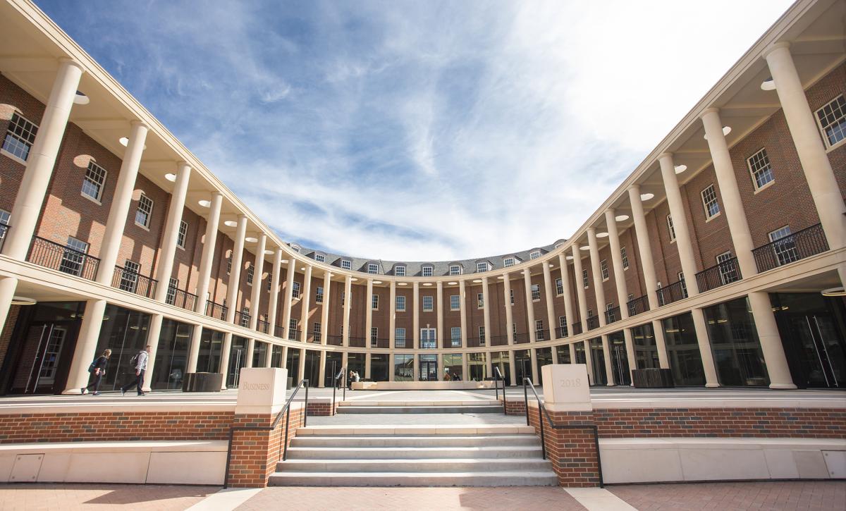
OSU alumnus Rand Elliott, the architect who designed the new Business Building, says the crescent shape is associated with the origins of Georgian architecture as seen throughout the campus.
Rand Elliot formally presented a stack of conceptual drawings for Oklahoma State's new Business Building, flipping through 37 possibilities and sliding each contender onto the desk before him.
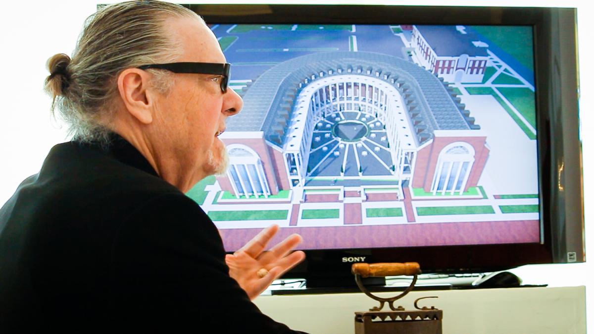
While Elliott, an OSU graduate and architect and founder of Oklahoma City’s Elliott + Associates, moved on, OSU architect Nigel Jones kept thumbing through the stack, seeking an outlier, a crescent-shaped design different from anything on OSU’s campus.
As Elliott tells it now: “At one point, Nigel said, ‘Rand, wait, can we go back?’ And I said sure. We went back to that particular idea, and he just said, ‘I think that’s it.’”
The rest is history — literally — in revealing why the unique shape of the new Business Building is so right.
History shaped the new building, through different ways, for the two architects.
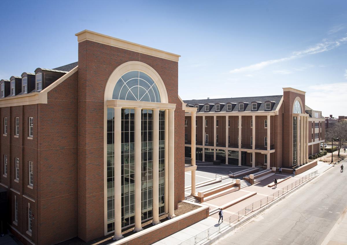
The building, which opened in January 2018 with Spears Business Dean Ken Eastman declaring it "Open for Business," has drawn rave reviews.
“I’m from England originally,” says Jones, who was OSU’s architect with Long Range Facility Planning.
Elliott went to England, figuratively, to research the roots of Georgian architecture, the style dating back to the reign of England’s King George that is already featured across the Stillwater campus.
The result is OSU’s eye-catching new structure, the crescent-shaped Business Building that houses the Spears School of Business. Its distinct personality is showcased inside and out through its look, its feel and its aim to effectively serve both students and faculty.
The building, which opened in January 2018 with Spears Business Dean Ken Eastman declaring it “Open for Business,” has drawn rave reviews.
“I was amazed by the beauty and uniqueness of the design. It was classical and traditional while at the same time fresh and functional for our campus. Thanks to the design brilliance of Rand Elliott and his team, we knew we had a special, iconic building for our beautiful campus.”
"I was really happy we had found something we truly understood the connection to and
would be unique to the campus."
A Crescent Push
Thanks, too, to Jones, who kept turning back to the crescent design, seen more commonly in England through the architectural styles formed between 1714 and 1830, when a series of King Georges — I, II, III and IV — ruled in succession.
Jones recognized the look, was drawn to it and pushed it for consideration.
“The idea of the crescent — there’s one called the Royal Crescent in Bath (England) from the 18th century — that was quite a well-known architectural form of Georgian architecture,” says Jones, now OSU’s emeritus university architect after retiring in the fall.
“Think of the Coliseum; it’s sort of an inside-out Coliseum. That’s part of what those architects at that time were looking at. They were looking at the precedent, but they were also seeing how they could apply it to what they needed in the 18th century.”
The building's many features, both interior and exterior, were all made possible through the collaboration between Elliott + Associates and Manhattan Construction.
Elliott found the use of crescents and curves and arcs in his research, and he included the concept in one of his many drawings for OSU, although with little thought it would be the choice.
“I was completely surprised,” Elliott says, “because I thought it was a radical approach to doing this. But the reality is, it’s truly associated with the origins of Georgian architecture. So, we took it on in a very pure point of view.
“I didn’t have any expectation. We were just trying to do our job. As we went through those, (Nigel) picked up on it. And of course, he would, because he’s British. And I was really happy we had found something we truly understood the connection to and would be unique to the campus.”
Not Really for Baseball
The design is so unique to OSU that the building’s early construction created more than a little curiosity and confusion on campus.
One popular story tells of a school staff member walking on the heels of two students during the building’s infancy. One woman was insistent that it was the site of the school’s new baseball stadium, despite her friend’s arguments to the contrary.
The building’s courtyard might invite a fun game of wiffle ball, but mostly it’s all business.
“Not only does it fit the campus, obviously, but it’s about business,” Elliott says.
“Businesses are often successful because they look at something differently. And you look at this building differently. We think that is a real asset and something that Ken (Eastman) has really embraced, that, ‘Wow, this is a really unexpected business school,’ in how it was designed and how it was focused from a functional point of view, but its appearance as well.”
The building’s many features, both interior and exterior, were all made possible through the collaboration between Elliott + Associates and Manhattan Construction.
“Our relationship with Manhattan with this project — and we’ve worked with them on several projects — is one of great respect and collaboration,” Elliott says. “And that’s what you have to do. It’s about drawing it, conceiving it, putting it together. Then when you get in the field, there are all sorts of opportunities to improve on it, to move a pipe left or right and you get more ceiling height. And it takes everyone to be dedicated to that point of view to truly create a successful project.”
Inside and Out
From any distance, the shape of the 147,450-square-foot, $72-million structure itself is captivating. The courtyard, designed as a welcoming, relaxing outdoor space, is complete with a water element that will create a fog cloud. The Georgian brick is accented by expansive windows and columns. A second-floor balcony, with its view onto the courtyard, offers more space for studying or relaxing.
The Crystal Room is all white, with white marble floors and white walls, and features a large arched-glass window.
Inside, the building contains classrooms, team/breakout rooms, conference rooms and offices, as well as feature spaces. One, the Crystal Room on the north end’s fourth floor, is all white, with white marble floors and white walls, and features a large arched-glass window offering a new take on the campus.
“It affords views on campus that have never been seen before,” says Mike Mays, one of Elliott’s staff architects. “It frames perfectly the library clock tower. It is stunning, absolutely stunning.”
The south end’s fourth floor houses the Tack Room, another unique meeting space, highlighted by one wall fully adorned with cow hides.
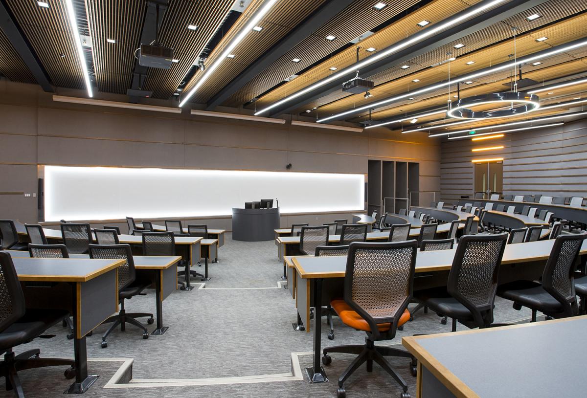
One premium classroom is the circular, glass-enclosed Watson Trading Floor, which mimics the New York Stock Exchange, complete with an electronic ribbon displaying the trends of the day in the market.
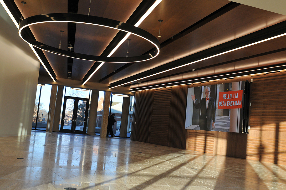
The Keystone Commons is a large gathering space for students on the building’s east side. And there’s a coffee shop, too, Business Perks, which adds more convenience and comfort. The special hidden areas, nooks and crannies, have their own special term from Elliott: sticky spaces.
“There are wonderful surprises throughout the building,” Elliot says.
“Sticky spaces are those little adjunct places in a corridor or outside a classroom where something sort of surprising happens. A group finds itself coalescing or coming together to study, and they do it right there. It doesn’t have to be in a classroom. It can be in an impromptu kind of space.”
Up to the Lighting
Even the lighting is specialized, featuring many circles that reflect the crescent identity. The floors on the loggia feature a series of four-foot discs made up of three layers of glass, stretching end to end and acting as skylights offering natural light to the basement.
“Once you walk inside the door, the outside is a ‘Wow,’ but the inside, the way that Rand has developed all those spaces around the loggia and the different centers, each one is unique in its own way,” Jones says.
The building also offers a distinct flow on the east end of campus, its crescent shape softer than a blockade. And it’s an impressive bookend to a key stretch of campus.
“It is a perfect complement to our campus design and tradition, and it is the perfect east anchor for Legacy Walk,” Hargis says. “It greatly enhances what is already one of America’s most beautiful campuses. As wonderful as it is on the outside, most importantly, it is a functional gem inside as well. The building provides a dynamic, educational environment that promotes interaction and collaboration, while offering highly flexible space and the latest in technology.”
How the building connects, more than just physically, was another key focus for Elliott and his staff. They delved into making the building tick on the inside.
“We always start by (asking) who is the occupant?” Elliot says. “Who’s going to be in this building? And what might we do to answer their questions and solve their problems?”
A Building Study
In search of the answers, Elliott requested that OSU do a study of its students and faculty to find out what was important to them in a new building.
“It was a very interesting research project in that it’s not often done for buildings,” he says. “It’s just assumed you know this or know that. But this particular instance, we really wanted to know what the students expected out of it, and what the faculty expected out of it.
The word that came out of that is everyone wanted an ‘interactive opportunity.’ Interactive. So that became our keyword. And how do you do that?
“If you interview the millennial audience, you know that they’re educated differently. They’re educated in teams. They work in groups. And it tends to be that point of view. So, what does a collaborative space begin to look like? If you want interactive things, interactive requires collaboration. And it was really wonderful research to be able to do that. And we translated that to this building.”
Elliott and his company have made a mark with unique designs, leading to many awards. It built the Chesapeake Energy campus and worked along the Oklahoma River Boathouse District, where Elliott’s touch is apparent in the sharp noses of rowing shells that highlight the area. His work also includes Pops restaurant in Arcadia, as well as other original buildings outside Oklahoma.
Interestingly, Elliott says he never would have envisioned getting involved with Georgian architecture when he was studying his craft at OSU.
“Not at all,” he says. “As I was being trained, it was about modernism, about doing contemporary buildings and so forth. If you would have said, ‘Rand, do you see yourself doing historic buildings in your career?’ I would have said, ‘No, no, no, I’m a modernist. That’s not my point of view.’
“But as I began to get involved in doing historic preservation projects and so forth, your love for them, your appreciation for history, the realization of what came before becomes really important. I think that appreciation and that experience on my part of the firm has made a big difference. You tend to be sympathetic. And you see a challenge in terms of, ‘How do you make something great happen that is sensitive to a particular stylistic approach that is difficult to deal with?’”
With the new Business Building, he succeeded in addressing that challenge, adding his stamp to a campus he credits for largely shaping who he is today.
“It wouldn’t have happened had Nigel not said, ‘I think this is pretty cool,’” Elliott reminds. “That went to Burns, and it was important for him to sign on and be enthusiastic as well. And he has been. And I’m thankful for that.”
Jones is thankful to have played a part in a new signature building on campus.
“In a way, (Elliott) rather dismissed it as being a rather whimsical thing and sort of turned the page and we went forward,” Jones says. “I was sitting there, and he turned the page, and I kept going like this (pretending to peek through the stack).
“I don’t know what we would have ended up with. I don’t know if my successor would have gone for it or not. I suspect no. We would have probably ended up with a rectilinear u-shape, or something or other, rather than the crescent.
“So, you can praise me or blame me.” In this case, it’s all praise, for both the concept and the building. “I am very critical of my own work, as I think most creative people are,” Elliot says. “You envision it being perfect. And nothing in life is perfect. But I’m really proud of this building.
“In order to get a building designed and on that campus that is sympathetic to everything that is going on with its history and architectural point of view is a real challenge. I think we rose to that challenge. And we’re excited about the result.”
Named Spaces
Many spaced in the new Business Building are named after donors. A complete list of donors is available on the Legacy Wall digital sing on the first floor of the new Business Building.
Basement
BancFirst Classroom BKD CPAs and Advisors Classroom
Bob and Peggy McCormick Breakout Room (Merrick Foundation)
Deloitte Data Analytics Technology Applications (DATA) Lab
Grant Thornton Breakout Room Herod Family Breakout Room HoganTaylor Breakout Room KPMG Breakout Room
Le Norman Auditorium
Leitner and Ken Greiner Technology Classroom
Pregler Family Breakout Room (Mike, Jan, Chris, Matt and Brooke)
PwC Breakout Room Shellie and Don Greiner Breakout Room
Wesley E. and Mary Lea Sample Family Classroom
First Floor
BOK Financial Ticker
Brian and Angela Callahan Conference Room
Center for Advanced Global Leadership & Engagement (CAGLE)
Chesapeake Energy Business Student Success Center
ConocoPhillips Student Lounge
Eastin Center for Career Readiness
EY Entrepreneurial Zone
First United Bank and Trust Room gifted by the Massey Family
Bob Austin Family Team Room
Rob, Stacey and Haley Stephens Media Wall
Stephen and Diane Tuttle Accelerator
Jack Allen Family Education Foundation Genius Bar
Riata Center for Entrepreneurship Watson Trading Floor
Wiese Brothers Faculty Office Suite in memory of Jon A. Wiese
Second Floor
Bill and Marsha Barnes Conference Room Dr. B. Curtis Hamm Classroom
Dr. Lloyd Garrison Conference Room gifted by Dr. Carlos Johnson
ExxonMobil OSU Alumni Sticky Space
Michael and Anne Greenwood Center for Online Learning
The Nix Family Team Room Elwell Family Sticky Space
Grigsby Family Upper Loggia (South) (Jennifer and Steven Grigsby)
Jones Family Upper Loggia (North) (Mindi and Griff Jones)
Watson Graduate School of Management
Third Floor
ExxonMobil Controllers Alumni Classroom
Howard Thill Team Room
John and Caroline Linehan Conference Room
Julie and Claude Connelly Team Room Merrill Family Sticky Space Norman and Suzanne Myers Dean’s Suite Robert and Sharon Keating Team Room Robert Glenn Rapp
Foundation Team Room
Fourth Floor
Billings Family Team Room (Frank, Jennifer, Taylor, Cole and Kelsey)
Boelte Family Sticky Space Calvert Family Sticky Space
Dr. B. Curtis Hamm Office of the School of Marketing & International Business
Dr. Wilton T. Anderson Office of the School of Accounting
Joel and Melinda Stinnett Team Room John Yeaman Team Room
Roger Lumley and Suzanne Dimmel Team Room
School of Entrepreneurship
Sharon and David Trojan Family Faculty Office
Exterior
BancFirst Time Capsule Marker
Richard L. Tourtellotte Family Garden
